IDFC FIRST Bank × BCG
UX Research + Experience & Communication Design

UX Research + Experience & Communication Design

Reducing Support Dependency Through Design and Financial Clarity

Reducing Support Dependency Through Design and Financial Clarity

01 — Overview

Problem: The brief was to reduce call center volumes for IDFC FIRST Bank. During the research phase, we discovered that a significant number of customer queries were related to EMIs. Many users were struggling to understand basic terms within the credit card and billing ecosystem, especially around EMI conversions, billing cycles, and statement breakdowns. These recurring points of confusion were driving repeated support calls at scale.

The solution was designed in two stages.

  1. The first focused on proactive communication. We mapped the customer’s billing cycle and identified moments where confusion and anxiety were most likely to occur. Based on this, we developed a WhatsApp communication strategy that delivered timely and contextual information before customers felt the need to contact support.

  2. The second stage focused on in-app improvements. We introduced an educational carousel within the card dashboard to explain key billing and EMI-related terms in a simple and contextual manner. We also redesigned the EMI section by introducing a visual breakup of active EMIs directly within the dashboard, making it easier for users to find it quickly and understand their upcoming bills, track individual EMIs, and set clearer payment expectations.


Impact: Following the implementation of the proposed interventions, EMI-related call volumes reduced by 14.6%. The redesigned communication and payment experience also contributed to an increase in monthly collections, with more users paying the correct due amount instead of the minimum balance or missing payments entirely, resulting in an uplift of up to ₹8 crore.

Problem: The brief was to reduce call center volumes for IDFC FIRST Bank. During the research phase, we discovered that a significant number of customer queries were related to EMIs. Many users were struggling to understand basic terms within the credit card and billing ecosystem, especially around EMI conversions, billing cycles, and statement breakdowns. These recurring points of confusion were driving repeated support calls at scale.

The solution was designed in two stages.

  1. The first focused on proactive communication. We mapped the customer’s billing cycle and identified moments where confusion and anxiety were most likely to occur. Based on this, we developed a WhatsApp communication strategy that delivered timely and contextual information before customers felt the need to contact support.

  2. The second stage focused on in-app improvements. We introduced an educational carousel within the card dashboard to explain key billing and EMI-related terms in a simple and contextual manner. We also redesigned the EMI section by introducing a visual breakup of active EMIs directly within the dashboard, making it easier for users to find it quickly and understand their upcoming bills, track individual EMIs, and set clearer payment expectations.


Impact: Following the implementation of the proposed interventions, EMI-related call volumes reduced by 14.6%. The redesigned communication and payment experience also contributed to an increase in monthly collections, with more users paying the correct due amount instead of the minimum balance or missing payments entirely, resulting in an uplift of up to ₹8 crore.

02 — The Brief

Finding Focus in a Complex System

In the summer of 2024, I interned with Boston Consulting Group while pursuing my master’s at Indian Institute of Technology Delhi. I joined the FinTech team at BCG and worked on a project for IDFC FIRST Bank, where the goal was to reduce call center volumes for their growing credit card business.

The challenge initially felt too broad. Customer support teams were handling queries across fraud, rewards, disputes, card controls, and several other categories. To identify a meaningful intervention area, we began analyzing support transcripts and IVR routing data.

One pattern stood out immediately. A significant number of customers were repeatedly calling about EMI-related queries. Most of these concerns were not complex issues, but confusion around basic billing terms, EMI structures, payment expectations, and statement understanding.

In the summer of 2024, I interned with Boston Consulting Group while pursuing my master’s at Indian Institute of Technology Delhi. I joined the FinTech team at BCG and worked on a project for IDFC FIRST Bank, where the goal was to reduce call center volumes for their growing credit card business.

The challenge initially felt too broad. Customer support teams were handling queries across fraud, rewards, disputes, card controls, and several other categories. To identify a meaningful intervention area, we began analyzing support transcripts and IVR routing data.

One pattern stood out immediately. A significant number of customers were repeatedly calling about EMI-related queries. Most of these concerns were not complex issues, but confusion around basic billing terms, EMI structures, payment expectations, and statement understanding.

That insight became the focal point of the project: reducing confusion around EMIs and the bill statement before it turned into a support call.

That insight became the focal point of the project: reducing confusion around EMIs and the bill statement before it turned into a support call.

With the problem space clearly defined, the next step was understanding how the team approached the challenge and where I contributed within the larger workflow.

With the problem space clearly defined, the next step was understanding how the team approached the challenge and where I contributed within the larger workflow.

03 — The Team & My Role

Team Structure and Research Direction

The project was executed as an eight-week engagement with a lean team consisting of a client consultant, a product manager, a senior design associate, and myself. I contributed as a UX researcher and designer, owning the qualitative research protocol, user segmentation model, communication framework, and the in-app information architecture and interface design.

The initial plan was to rely primarily on secondary data such as CRM logs, call volume reports, and category-level breakdowns. I pushed for a qualitative listening approach instead, arguing that customer conversations would reveal not just what users were struggling with, but how they described their confusion and how support agents resolved it in real time.

To support this direction, I proposed a structured listening protocol for analyzing customer support calls. That framework eventually became the foundation for the entire research methodology discussed in the next section.

The project was executed as an eight-week engagement with a lean team consisting of a client consultant, a product manager, a senior design associate, and myself. I contributed as a UX researcher and designer, owning the qualitative research protocol, user segmentation model, communication framework, and the in-app information architecture and interface design.

The initial plan was to rely primarily on secondary data such as CRM logs, call volume reports, and category-level breakdowns. I pushed for a qualitative listening approach instead, arguing that customer conversations would reveal not just what users were struggling with, but how they described their confusion and how support agents resolved it in real time.

To support this direction, I proposed a structured listening protocol for analyzing customer support calls. That framework eventually became the foundation for the entire research methodology discussed in the next section.

04 — Research Methodology

Research Through Customer Conversations

To study the problem in depth, I designed a focused call-listening methodology that treated customer support conversations as a structured form of qualitative data. Instead of running research and synthesis as separate phases, insights were continuously fed into the design workflow in real time. This allowed the team to identify patterns, validate assumptions, and shape interventions while the research was still in progress.

To study the problem in depth, I designed a focused call-listening methodology that treated customer support conversations as a structured form of qualitative data. Instead of running research and synthesis as separate phases, insights were continuously fed into the design workflow in real time. This allowed the team to identify patterns, validate assumptions, and shape interventions while the research was still in progress.

1

Sampling Framework

Approach: Calls were sampled across EMI categories, billing cycle phases, and customer states such as pre-conversion, post-conversion, pre-due, and post-due periods.

Purpose: To ensure coverage across the full EMI and billing journey while identifying recurring audience segments.

2

Structured Listening Log

Approach: Each call was tagged against EMI type, billing phase, primary concern, emotional state, and final resolution. Over 300+ EMI-related calls were analyzed across internally defined cohorts.

Purpose: To capture not only what customers were asking, but also when confusion appeared and how support teams resolved it.

3

Affinity Synthesis

Approach: Call observations were clustered by question type, timing, and behavioral patterns. Clusters were named by underlying anxieties rather than surface-level issues.

Purpose: To uncover deeper emotional and cognitive patterns such as uncertainty around EMI conversion, payment expectations, or bill interpretation.

1

Bias Mitigation

Approach: Cluster labels and categorizations were independently reviewed by the senior design associate before final taxonomy alignment.

Purpose: To reduce interpretation bias and ensure consistency before moving into design interventions.

One methodological decision became especially important during the process. Along with logging customer questions, I also mapped when those questions appeared within the billing cycle. This timing data later became the foundation for the proactive communication calendar. At the same time, the phrasing patterns collected during affinity synthesis directly informed the language system used across the final communication design.

One methodological decision became especially important during the process. Along with logging customer questions, I also mapped when those questions appeared within the billing cycle. This timing data later became the foundation for the proactive communication calendar. At the same time, the phrasing patterns collected during affinity synthesis directly informed the language system used across the final communication design.

05 — Key Findings

Patterns, Behaviors, and Insights

The research phase revealed that EMI-related confusion was not a single problem, but a collection of recurring anxieties shaped by customer type, billing behavior, and timing within the payment cycle. To make the problem actionable, customers were first organized into behavioral cohorts based on the EMI structures already defined internally by IDFC FIRST Bank.

These cohorts helped the team identify distinct patterns of confusion while also making it easier to test communication interventions at scale through targeted messaging.

The research phase revealed that EMI-related confusion was not a single problem, but a collection of recurring anxieties shaped by customer type, billing behavior, and timing within the payment cycle. To make the problem actionable, customers were first organized into behavioral cohorts based on the EMI structures already defined internally by IDFC FIRST Bank.

These cohorts helped the team identify distinct patterns of confusion while also making it easier to test communication interventions at scale through targeted messaging.

Credit card balance → EMI

Balance Conversion (Balcon)

Customers who converted their outstanding card balance into EMIs.
Primary Concerns: Confusion around payable amount, processing fees, EMI reflection, and blocked credit limits.

User need: Clear bill breakdowns, payment clarity, and reassurance after conversion.

Purchase → vendor-initiated EMI

Merchant EMI

Customers who opted for EMI offers directly through merchants during purchase.
Primary Concerns: “No Cost EMI” confusion, foreclosure charges, EMI confirmation, and interest expectations.

User need: Transparent explanations of EMI structures and merchant-bank relationships.

Completed transaction → EMI

Transaction EMI

Customers who converted specific transactions into EMIs after purchase.
Primary Concerns: Uncertainty around conversion status, billing timelines, and EMI scheduling.

User need: Visibility into active EMIs, billing impact, and transaction-level tracking.

New to Bank (NTB)

Customers within the first few months of using the credit card.
Primary Concerns: Basic understanding of statements, EMI mechanics, due dates, and payment systems.

Customers within the first few months of using the credit card.
Primary Concerns: Basic understanding of statements, EMI mechanics, due dates, and payment systems.

User need: Foundational education and simplified terminology.

Chronic Callers

Customers repeatedly contacting support across billing cycles.
Primary Concerns: Persistent anxiety, repeated validation seeking, and low trust in system feedback.

Customers repeatedly contacting support across billing cycles.
Primary Concerns: Persistent anxiety, repeated validation seeking, and low trust in system feedback.

User need: Proactive reassurance and predictable communication touchpoints.

The single most important insight from the research was that customer confusion was closely tied to timing within the billing cycle.

The single most important insight from the research was that customer confusion was closely tied to timing within the billing cycle.

Call volumes consistently peaked at five recurring moments: immediately after EMI conversion, before the statement date, on statement day, two days before the due date, and on the due date eve. Each phase reflected a different emotional state, ranging from reassurance seeking to peak payment anxiety.

This insight fundamentally changed the design approach. The goal was no longer just to simplify information, but to deliver the right information before customers felt the need to call support.

Call volumes consistently peaked at five recurring moments: immediately after EMI conversion, before the statement date, on statement day, two days before the due date, and on the due date eve. Each phase reflected a different emotional state, ranging from reassurance seeking to peak payment anxiety.

This insight fundamentally changed the design approach. The goal was no longer just to simplify information, but to deliver the right information before customers felt the need to call support.

Core Customer Anxieties

Across cohorts and billing stages, six recurring anxieties consistently appeared in customer conversations:

Across cohorts and billing stages, six recurring anxieties consistently appeared in customer conversations:

“Why does my bill amount look different from what I expected?”

Customers mentally estimated future bills, but processing fees, GST, or partial conversions disrupted those expectations.

“Did my EMI conversion actually go through?”

App didn't update in real time. System feedback was delayed, missed, or not visible just after conversion requests.

“When will this EMI start, end, or reflect in my statement?”

Billing cycles and EMI schedules were poorly mapped within the app experience, creating uncertainty around payment timing.

“How much am I supposed to pay this month?”

EMI deductions, minimum due amounts, and outstanding balances were difficult to interpret together.

“Which EMIs are included in this bill?”

Existing statements lacked a clear visual structure for tracking active EMIs and their timelines.

“Why am I being charged interest on a No Cost EMI?”

Customers misunderstood how merchant-funded discounts and bank-side interest structures worked.

Call volumes consistently peaked at five recurring moments: immediately after EMI conversion, before the statement date, on statement day, two days before the due date, and on the due date eve. Each phase reflected a different emotional state, ranging from reassurance seeking to peak payment anxiety.

This insight fundamentally changed the design approach. The goal was no longer just to simplify information, but to deliver the right information before customers felt the need to call support.

Call volumes consistently peaked at five recurring moments: immediately after EMI conversion, before the statement date, on statement day, two days before the due date, and on the due date eve. Each phase reflected a different emotional state, ranging from reassurance seeking to peak payment anxiety.

This insight fundamentally changed the design approach. The goal was no longer just to simplify information, but to deliver the right information before customers felt the need to call support.

06 — Strategic Pivot

Expanding the Scope

The original project scope focused primarily on in-app UX improvements. However, the research revealed that most customer confusion emerged before critical information became visible inside the app.

Many of the highest-anxiety moments occurred before information became available inside the app. Statement details appeared only on the statement date, while customer anticipation and uncertainty began much earlier. EMI conversions also reflected with delays. In several cases, customers trusted human confirmation from support agents more than system feedback inside the app itself, especially repeat callers seeking reassurance.

This revealed an important gap. A solution that existed only inside the app would fail to reach customers at the moments when confusion was actually building.

To make this visible to the team, I mapped the billing cycle against call spikes and emotional behavior patterns identified during research. The pattern was clear: customer anxiety consistently peaked at predictable moments before key billing events. Based on this, I proposed expanding the project scope beyond product interventions and introducing a proactive communication layer.

Since IDFC FIRST Bank already had an existing WhatsApp communication channel, the proposal was to build a structured lifecycle-based messaging system that could deliver timely reassurance and contextual EMI information before customers felt the need to call support.

The original project scope focused primarily on in-app UX improvements. However, the research revealed that most customer confusion emerged before critical information became visible inside the app.

Many of the highest-anxiety moments occurred before information became available inside the app. Statement details appeared only on the statement date, while customer anticipation and uncertainty began much earlier. EMI conversions also reflected with delays. In several cases, customers trusted human confirmation from support agents more than system feedback inside the app itself, especially repeat callers seeking reassurance.

This revealed an important gap. A solution that existed only inside the app would fail to reach customers at the moments when confusion was actually building.

To make this visible to the team, I mapped the billing cycle against call spikes and emotional behavior patterns identified during research. The pattern was clear: customer anxiety consistently peaked at predictable moments before key billing events. Based on this, I proposed expanding the project scope beyond product interventions and introducing a proactive communication layer.

Since IDFC FIRST Bank already had an existing WhatsApp communication channel, the proposal was to build a structured lifecycle-based messaging system that could deliver timely reassurance and contextual EMI information before customers felt the need to call support.

07 — Constraints

System Constraints and Design Responses

The path from insights to final solutions is never linear. As the interventions evolved, three major constraints shaped the direction of the design system. Instead of treating them as blockers, the goal was to design around them while keeping the experience transparent, trustworthy, and easy to understand.

The path from insights to final solutions is never linear. As the interventions evolved, three major constraints shaped the direction of the design system. Instead of treating them as blockers, the goal was to design around them while keeping the experience transparent, trustworthy, and easy to understand.

Compliance Constraint

Legal language requirements

Early message drafts used conversational language taking directly from the customer calls. However, financial communication required legally accurate terminology around statement balances, outstanding amounts, and due dates.

Resolution: A two-layer language system was introduced. Compliance-approved terminology handled critical financial information, while conversational language was used around it to provide clarity and interpretive context.

Technical Constraint

App update latency

EMI conversions often took up to 24 hours to reflect inside the app. Sending instant confirmation messages risked creating further confusion if customers checked the app immediately afterward

Resolution: The delay was made explicit within the communication itself. Messages transparently stated that EMI updates could take up to 24 hours to appear in the app, turning a technical limitation into a trust-building disclosure.

Product Constraint

The current/next cycle split

One of the most common queries was why a newly converted EMI was not visible in the current bill. This behavior was rooted in a fixed product rule where EMIs only appeared in the following billing cycle.

Resolution: Instead of hiding the rule, the design made it visible. Communication and in-app flows clearly differentiated between the current and next billing cycle, helping customers understand when the EMI would reflect and what charges would appear immediately.

These constraints ultimately reinforced an important design principle for the project: clarity builds trust. The solution was not about hiding system limitations, but about making them understandable before they turned into customer confusion.

These constraints ultimately reinforced an important design principle for the project: clarity builds trust. The solution was not about hiding system limitations, but about making them understandable before they turned into customer confusion.

08 — Solution Architecture

Communication and Product Interventions

The final solution was designed as a two-part system that addressed customer confusion both before and during key billing moments. The first layer focused on proactive communication, while the second focused on improving visibility and understanding inside the app itself

The final solution was designed as a two-part system that addressed customer confusion both before and during key billing moments. The first layer focused on proactive communication, while the second focused on improving visibility and understanding inside the app itself

Proactive
Communication System

A lifecycle-based communication system was designed across WhatsApp, push notifications, audio notes, tutorials, and visual explainers. Communication was personalized using customer-specific EMI details, amounts, and due dates, while CTAs were tailored to different billing stages and customer cohorts. The system focused on proactively resolving confusion through reminders, FAQs, bilingual educational content, and guided navigation before customers reached peak anxiety moments.

In-App
Experience

The in-app intervention focused on consolidating billing and EMI information into a single transparent dashboard. The redesigned experience introduced structured EMI visibility, simplified bill breakdowns, and contextual educational overlays that explained key billing terms, payment expectations, and EMI behavior directly within the interface.

09 — Solution Deep Dive: Communication System

Lifecycle-Based Communication Design

The communication system was designed as a lifecycle-based curriculum that mapped customer anxieties against key billing moments. Instead of sending generic reminders, every communication was timed around predictable moments of confusion identified during research.

The goal was to progressively move them from reassurance seeking to self-sufficiency.

The communication system was designed as a lifecycle-based curriculum that mapped customer anxieties against key billing moments. Instead of sending generic reminders, every communication was timed around predictable moments of confusion identified during research.

The goal was to progressively move them from reassurance seeking to self-sufficiency.

C+1 · Conversion +1 day

Confirmation & reassurance

Primary job: Confirm EMI conversion, explain current vs next billing cycle split, and answer the top conversion-related FAQs before confusion builds.

Emotional job: transform uncertainty into confidence.

C+2 · Conversion +2 days

App Wayfinding & Capability building

Primary job: Introduce app wayfinding through swipe tutorials and guided navigation to help users independently track and manage EMIs.

Emotional job: from reassurance to empowerment.

S+1 · Statement Drops

Expectation Setting

Primary job: Prepare customers for upcoming charges, explain processing fees, and clarify when EMI deductions will begin.

Emotional job: inoculate against surprise.

S+1 · Statement Drops

Bill interpretation

Primary job: Break down statement amounts, explain minimum due vs total due, and simplify banking terminology using tutorials and contextual education.

Emotional job: replace confusion with comprehension.

D−2 · Before Due Date

Payment Clarity & Action

Primary job: Reinforce exact payable amounts, explain consequences of minimum payments, and provide direct payment actions.

Emotional job: urgent but not threatening. Clear path

D−1 · Final Touch

Final reassurance and action

Primary job: Deliver urgent reminders, simplify EMI visibility, and provide quick navigation paths for payment and EMI management.

Emotional job: agency at the critical moment.

The framework was also cohort-aware. Messaging logic adapted based on factors such as active EMI history, current-cycle EMI behavior, new-to-bank users, and chronic calling patterns. This allowed communication to remain highly contextual instead of becoming repetitive or generic.

For ease of understanding, in the example shown below I have mapped the journey of a customer with both a previous-cycle EMI and a newly converted transaction EMI in the current cycle. The communication progressively shifts across the lifecycle:

The framework was also cohort-aware. Messaging logic adapted based on factors such as active EMI history, current-cycle EMI behavior, new-to-bank users, and chronic calling patterns. This allowed communication to remain highly contextual instead of becoming repetitive or generic.

For ease of understanding, in the example shown below I have mapped the journey of a customer with both a previous-cycle EMI and a newly converted transaction EMI in the current cycle. The communication progressively shifts across the lifecycle:

The framework was also cohort-aware. Messaging logic adapted based on factors such as active EMI history, current-cycle EMI behavior, new-to-bank users, and chronic calling patterns. This allowed communication to remain highly contextual instead of becoming repetitive or generic.

For ease of understanding, in the example shown below I have mapped the journey of a customer with both a previous-cycle EMI and a newly converted transaction EMI in the current cycle. The communication progressively shifts across the lifecycle:

The framework was also cohort-aware. Messaging logic adapted based on factors such as active EMI history, current-cycle EMI behavior, new-to-bank users, and chronic calling patterns. This allowed communication to remain highly contextual instead of becoming repetitive or generic.

For ease of understanding, in the example shown below I have mapped the journey of a customer with both a previous-cycle EMI and a newly converted transaction EMI in the current cycle. The communication progressively shifts across the lifecycle:

10 — Solution Deep Dive: In-App

Reframing the Credit Card Dashboard

While the proactive communication system addressed confusion outside the app, the in-app experience still carried major gaps in comprehension and discoverability.

The first challenge was terminology understanding. The dashboard displayed multiple financial terms such as total outstanding, statement balance, recent payment, and minimum due, but customers struggled to understand what these numbers meant and how they related to their actual payment behavior.

To solve this, a contextual education layer was introduced directly within the dashboard. A persistent red entry point titled “Understand your credit card terms” was placed immediately below the primary billing information, making help visible at the exact moment confusion occurred.

While the proactive communication system addressed confusion outside the app, the in-app experience still carried major gaps in comprehension and discoverability.

The first challenge was terminology understanding. The dashboard displayed multiple financial terms such as total outstanding, statement balance, recent payment, and minimum due, but customers struggled to understand what these numbers meant and how they related to their actual payment behavior.

To solve this, a contextual education layer was introduced directly within the dashboard. A persistent red entry point titled “Understand your credit card terms” was placed immediately below the primary billing information, making help visible at the exact moment confusion occurred.

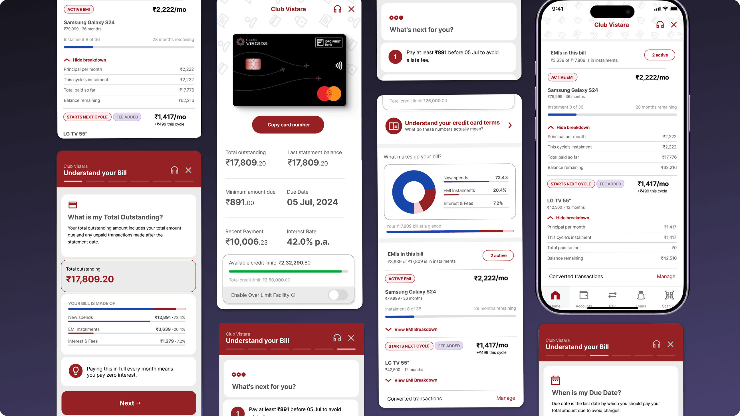
The redesigned credit card experience, left to right. The entry point retains familiar billing numbers (total outstanding, minimum due, due date) and immediately follows with an "Understand your credit card terms" CTA and a "What makes up your bill?" donut chart. Scrolling further reveals the "EMIs in This Bill" section—all EMI information now within the primary billing view, not behind a separate navigation path.
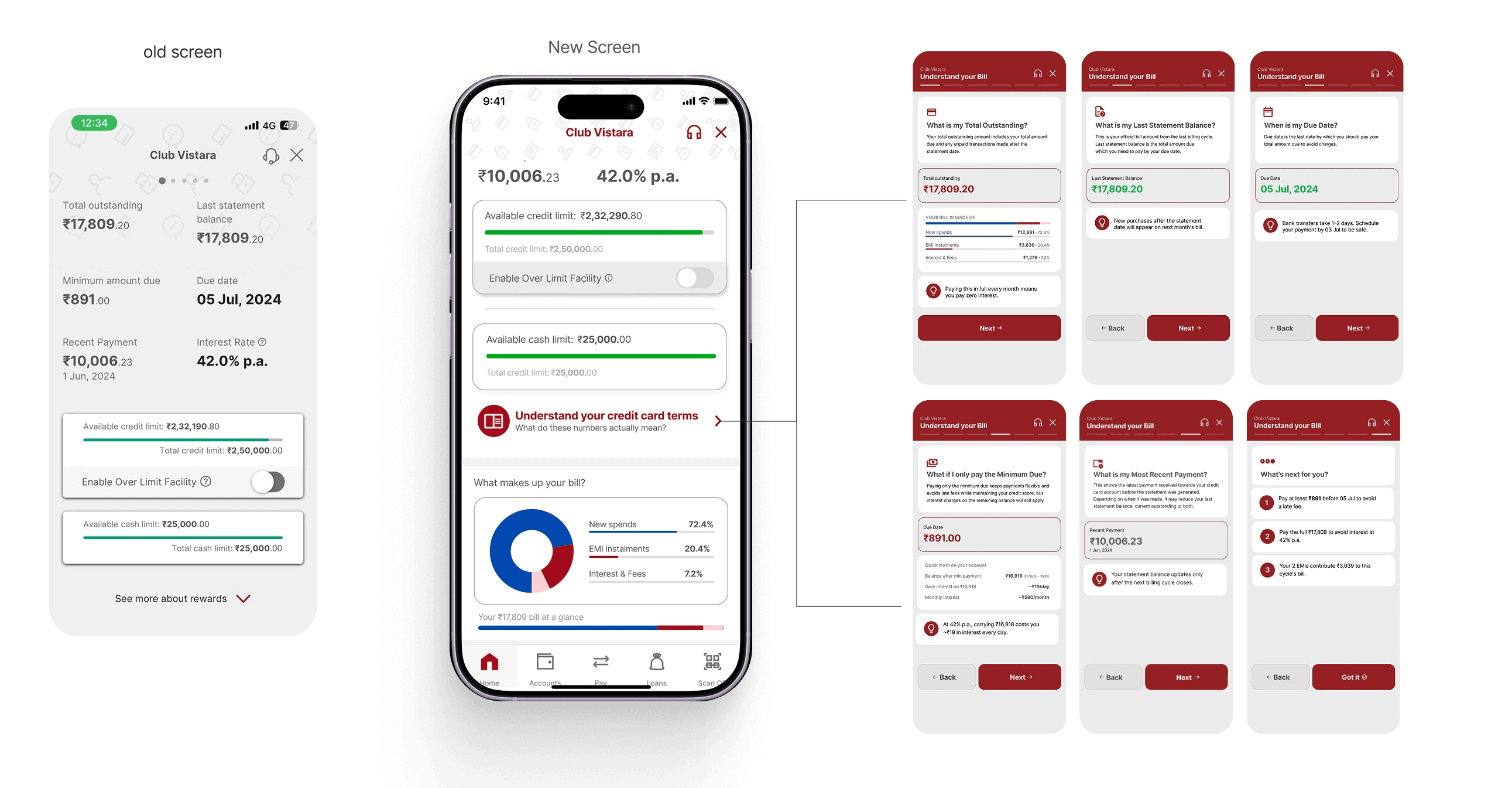
Tapping this entry point opened a guided modal designed around the six highest call-generating questions identified during research. Each screen focused on a single billing concept using the customer’s actual numbers in context, a plain-language explanation of what the number meant, and a practical explanation of what action the customer was expected to take next. The sequence transformed the dashboard from a static statement view into an interpretive and educational experience.

Tapping this entry point opened a guided modal designed around the six highest call-generating questions identified during research. Each screen focused on a single billing concept using the customer’s actual numbers in context, a plain-language explanation of what the number meant, and a practical explanation of what action the customer was expected to take next. The sequence transformed the dashboard from a static statement view into an interpretive and educational experience.

"Understand Your Bill" — the complete six-panel flow. Triggered by tapping "Understand your credit card terms" on the card dashboard. Each panel surfaces the customer's actual numbers alongside a plain-language definition and a contextual tip. Panel 4 (What if I only pay the Minimum Due?) includes a "quick math on your account" section showing daily and monthly interest costs—a direct response to the most emotionally charged calls in the research data. The final panel ("What's next for you?") synthesises everything into three clear, prioritised actions: what to pay, by when, and what your EMIs contribute.

The second challenge was EMI visibility and discoverability. Existing EMI information was deeply buried within the app under “Converted Transactions,” hidden behind multiple navigational layers and disconnected from the main billing overview. Customers found it difficult to locate active EMIs or understand how EMI deductions were contributing to their current bill.

The second challenge was EMI visibility and discoverability. Existing EMI information was deeply buried within the app under “Converted Transactions,” hidden behind multiple navigational layers and disconnected from the main billing overview. Customers found it difficult to locate active EMIs or understand how EMI deductions were contributing to their current bill.

The redesigned experience brought EMI visibility directly into the credit card dashboard. The interface first explained how much of the total bill was made up of EMI payments, followed by a structured breakdown of active and upcoming EMIs. Each EMI displayed its installment amount, tenure progress, remaining duration, and billing status within the current or next cycle.

One important design intervention was making invisible billing logic visible. Instead of hiding processing fees or next-cycle EMI behavior, the system explicitly surfaced them through labels such as “Starts Next Cycle” and “Fee Added.” This transformed backend product rules into understandable customer-facing information.

The redesign ultimately shifted the dashboard from being a passive statement view into an interpretive layer that actively helped customers understand, track, and manage their billing behavior.

The redesigned experience brought EMI visibility directly into the credit card dashboard. The interface first explained how much of the total bill was made up of EMI payments, followed by a structured breakdown of active and upcoming EMIs. Each EMI displayed its installment amount, tenure progress, remaining duration, and billing status within the current or next cycle.

One important design intervention was making invisible billing logic visible. Instead of hiding processing fees or next-cycle EMI behavior, the system explicitly surfaced them through labels such as “Starts Next Cycle” and “Fee Added.” This transformed backend product rules into understandable customer-facing information.

The redesign ultimately shifted the dashboard from being a passive statement view into an interpretive layer that actively helped customers understand, track, and manage their billing behavior.

"EMIs in This Bill" — two states and the breakdown interaction. Left: the collapsed EMI list showing both active states. Centre: the Samsung Galaxy S24 EMI with "View EMI Breakdown" expanded, showing principal per month (₹2,222), this cycle's instalment (₹2,222), total paid so far (₹17,776), and balance remaining (₹62,216). Right: the STARTS NEXT CYCLE + FEE ADDED state for the LG TV 55"—the tag combination immediately communicates that the ₹499 appearing this cycle is a setup fee, not an EMI payment, and that the ₹1,417/mo EMI starts from next month. This two-line design directly resolves the current/next cycle confusion that generated the highest call volume in the research data.

11 — Impact

Behavioral and Business Impact

The interventions were evaluated one month after implementation. Within this period, EMI-related call center volumes reduced by 14.6%, while monthly payment collections increased by nearly ₹8 crore. The system also contributed to a reduction in late fee incidents across customer cohorts.

The communication framework eventually evolved into six personalized tracks segmented by EMI type, prior EMI behavior, new-to-bank users, and chronic callers.

Interestingly, the increase in collections was not an explicit project goal. It emerged as a direct outcome of better information clarity. When customers understood concepts such as minimum due amounts, interest implications, partial payments, and EMI structures more clearly, many voluntarily chose to pay more than the minimum amount required.

One of the strongest learnings from the project was that clarity does not only reduce confusion. It also builds financial confidence and better payment behavior.

The interventions were evaluated one month after implementation. Within this period, EMI-related call center volumes reduced by 14.6%, while monthly payment collections increased by nearly ₹8 crore. The system also contributed to a reduction in late fee incidents across customer cohorts.

The communication framework eventually evolved into six personalized tracks segmented by EMI type, prior EMI behavior, new-to-bank users, and chronic callers.

Interestingly, the increase in collections was not an explicit project goal. It emerged as a direct outcome of better information clarity. When customers understood concepts such as minimum due amounts, interest implications, partial payments, and EMI structures more clearly, many voluntarily chose to pay more than the minimum amount required.

One of the strongest learnings from the project was that clarity does not only reduce confusion. It also builds financial confidence and better payment behavior.

12 — Reflection & Systems Thinking

What this project taught me about designing in complex systems

One of the biggest learnings for me was understanding the value of raw qualitative data. The calls did not just reveal what customers were confused about, but when they became confused, how they described that confusion, and what kind of reassurance they were actually looking for. That level of behavioral specificity completely changed how I approached the solution.

I also learned how critical language is in financial products. Writing for an interface is very different from regular communication. Every term, label, CTA, and explanation changes how people interpret money, risk, and payment behavior. A large part of the project became an exercise in balancing clarity, compliance, and trust without overwhelming the customer.

The constraints of working within a banking ecosystem also became one of the most interesting parts of the process. Technical limitations, compliance requirements, and fixed billing rules constantly forced us to rethink and reiterate the solutions. Surprisingly, many of those constraints led to stronger design decisions than what I started with.

Since the team was small, the design process was very iterative. I also got to experience a much faster working rhythm than I was used to. The project pushed me to test multiple directions quickly, think systemically, and refine ideas continuously through feedback and collaboration.

More than anything, this project gave me confidence in handling large and ambiguous problem spaces. It showed me how research, systems thinking, communication design, and product design can come together to shape meaningful behavioural change within highly complex environments.

One of the biggest learnings for me was understanding the value of raw qualitative data. The calls did not just reveal what customers were confused about, but when they became confused, how they described that confusion, and what kind of reassurance they were actually looking for. That level of behavioral specificity completely changed how I approached the solution.

I also learned how critical language is in financial products. Writing for an interface is very different from regular communication. Every term, label, CTA, and explanation changes how people interpret money, risk, and payment behavior. A large part of the project became an exercise in balancing clarity, compliance, and trust without overwhelming the customer.

The constraints of working within a banking ecosystem also became one of the most interesting parts of the process. Technical limitations, compliance requirements, and fixed billing rules constantly forced us to rethink and reiterate the solutions. Surprisingly, many of those constraints led to stronger design decisions than what I started with.

Since the team was small, the design process was very iterative. I also got to experience a much faster working rhythm than I was used to. The project pushed me to test multiple directions quickly, think systemically, and refine ideas continuously through feedback and collaboration.

More than anything, this project gave me confidence in handling large and ambiguous problem spaces. It showed me how research, systems thinking, communication design, and product design can come together to shape meaningful behavioural change within highly complex environments.

LET'S WORK

TOGETHER

BASED in New Delhi INDIA

UX + Communication Designer

Based in India, I design experiences and communication systems rooted in behavioral research. A keen eye for minimal aesthetics and elegant typography runs through my interactive design work.

LET'S WORK

TOGETHER

BASED in New Delhi INDIA

UX + Communication Designer

Based in India, I design experiences and communication systems rooted in behavioral research. A keen eye for minimal aesthetics and elegant typography runs through my interactive design work.

LET'S WORK

TOGETHER

BASED in INDIA . UX Designer

Based in India, I design experiences and communication systems rooted in behavioral research. A keen eye for minimal aesthetics and elegant typography runs through my interactive design work.

LET'S WORK

TOGETHER

BASED in New Delhi INDIA

UX + Communication Designer

Based in India, I design experiences and communication systems rooted in behavioral research. A keen eye for minimal aesthetics and elegant typography runs through my interactive design work.