Impact Focus: Loan discovery → Sign-up confidence → Conversion
Impact Focus: Loan discovery → Sign-up confidence → Conversion
User Experience Design
Improving Loan Discoverability for Rural Borrowers in India
Improving Loan Discoverability for Rural Borrowers in India

The Project
About Saral Loan
Saral — which means “simple” in Hindi — is a digital loan platform designed for Nucleus Software, a leading fintech solutions company that builds digital banking systems for financial institutions across India.
The platform aims to make borrowing easier and more transparent for users — especially those in semi-urban and rural areas who often find formal credit systems confusing or inaccessible.
As part of this project, my focus was on designing the loan discovery experience — the very first step in a borrower’s journey where users explore, compare, and understand loan options before deciding to apply.
Most drop-offs in loan journeys happen right at this stage — when users fail to find a loan that fits their needs or feel uncertain about how to proceed. My goal was to simplify this process through better information hierarchy, intuitive search, and accessible interaction design.
This case study focuses specifically on the loan discovery journey — the first and most critical step toward trust.
Saral — which means “simple” in Hindi — is a digital loan platform designed for Nucleus Software, a leading fintech solutions company that builds digital banking systems for financial institutions across India.
The platform aims to make borrowing easier and more transparent for users — especially those in semi-urban and rural areas who often find formal credit systems confusing or inaccessible.
As part of this project, my focus was on designing the loan discovery experience — the very first step in a borrower’s journey where users explore, compare, and understand loan options before deciding to apply.
Most drop-offs in loan journeys happen right at this stage — when users fail to find a loan that fits their needs or feel uncertain about how to proceed. My goal was to simplify this process through better information hierarchy, intuitive search, and accessible interaction design.
This case study focuses specifically on the loan discovery journey — the first and most critical step toward trust.
Context
Credit is available. Finding it is the problem.
Accessing credit in rural India isn’t easy. Only about one-third of rural households in India access formal credit (NABARD NAFIS, 2017; RBI 2023), leaving many dependent on informal lenders.
Most people hear about loans from neighbours, local bank staff, or WhatsApp forwards. Then comes a maze of paperwork, unclear eligibility rules, and app experiences full of jargon.
For a farmer preparing for the next crop cycle or a small-shop owner planning to restock, this lack of clarity often pushes them toward informal lenders. The result is predictable: faster access, but heavier debt.
Accessing credit in rural India isn’t easy. Only about one-third of rural households in India access formal credit (NABARD NAFIS, 2017; RBI 2023), leaving many dependent on informal lenders.
Most people hear about loans from neighbours, local bank staff, or WhatsApp forwards. Then comes a maze of paperwork, unclear eligibility rules, and app experiences full of jargon.
For a farmer preparing for the next crop cycle or a small-shop owner planning to restock, this lack of clarity often pushes them toward informal lenders. The result is predictable: faster access, but heavier debt.
I wanted to see if a better-designed digital discovery experience could make formal borrowing feel less distant — and maybe even build a little trust along the way.
I wanted to see if a better-designed digital discovery experience could make formal borrowing feel less distant — and maybe even build a little trust along the way.
The Core Challenge
Why Discovery Matters
In rural lending, discovery is everything.
It’s where curiosity turns into confidence — or disappears entirely.
Borrowers rarely start alone; they rely on community facilitators, self-help groups, and field agents to navigate the system. While these networks are invaluable, they also make people dependent.
If design could help users explore and compare loans independently — without fear of being misled — we could shift the balance toward informed self-reliance.
That became the goal: create a discovery flow that feels clear, honest, and approachable.
In rural lending, discovery is everything.
It’s where curiosity turns into confidence — or disappears entirely.
Borrowers rarely start alone; they rely on community facilitators, self-help groups, and field agents to navigate the system. While these networks are invaluable, they also make people dependent.
If design could help users explore and compare loans independently — without fear of being misled — we could shift the balance toward informed self-reliance.
That became the goal: create a discovery flow that feels clear, honest, and approachable.
The discovery redesign also lays groundwork for integrating credit literacy modules and government loan APIs in future iterations.
The discovery redesign also lays groundwork for integrating credit literacy modules and government loan APIs in future iterations.
The Landscape
How the loan journey typically unfolds
For most borrowers in India, the loan journey is long and fragmented. It begins with choosing the right loan type, amount, and tenure that fit their need
For most digital loan apps available today, the borrower journey typically looks like this:
For most borrowers in India, the loan journey is long and fragmented. It begins with choosing the right loan type, amount, and tenure that fit their need
For most digital loan apps available today, the borrower journey typically looks like this:
Step 1
Search for a Loan
Users browse available loan categories, banks, or schemes. Filtering options are usually technical, text-heavy, and not optimized for low-literacy users.
Step 2
Apply for a Loan
After identifying an option, users begin the formal application, selecting loan type, amount, and tenure.
Step 3
Document Submission
Borrowers are asked to upload income proof, or land ownership records, declarations of previous loans and dependents.
Step 4
Verification of Documents
Loan agents and automated systems validate the documents and assess eligibility.
Step 5
Approval and Disbursement
Once approved, funds are either disbursed directly into the borrower’s bank account or handed over through a field agent.
Step 6
Tracking Repayments
Borrowers track EMI schedules and repayment status through the app (or reminders via SMS/agents).
This search /explore module is a comprehensive guide to available loans, including information on different kind of loans, loan tenure, banks giving the loans and interest rates.
Around half of indebted rural households continue to borrow from informal sources such as moneylenders and traders, often because they are easier to access despite higher costs (NABARD NAFIS, RBI reports).
At the same time, the majority of outstanding rural debt is institutional (from banks, cooperatives, and government schemes). This shows that formal supply exists — but borrowers struggle to discover and access loans that actually fit their needs.
This search /explore module is a comprehensive guide to available loans, including information on different kind of loans, loan tenure, banks giving the loans and interest rates.
Around half of indebted rural households continue to borrow from informal sources such as moneylenders and traders, often because they are easier to access despite higher costs (NABARD NAFIS, RBI reports).
At the same time, the majority of outstanding rural debt is institutional (from banks, cooperatives, and government schemes). This shows that formal supply exists — but borrowers struggle to discover and access loans that actually fit their needs.
Research
Understanding the problem space
Before drawing a single wireframe, I spent time looking at existing loan apps — KreditBee, Navi, PaySense, CASHe, MoneyTap. I also spoke informally with people who had tried digital borrowing and gave up midway.
Here’s what stood out:
Difficult start: Apps demand sign-up before value. Most apps begin by asking for personal details and sign-up before showing any value. This discourages first-time users who simply want to browse and understand their options before committing.
Unclear and scattered discovery flow. With a wide database of loans and schemes, the navigation and filtering systems often feel broken. It was difficult for users to find and use filters, making it hard to quickly narrow down results to what fit their needs.
Poor search experience. Search relies heavily on technical terms and keywords. Users without prior financial knowledge struggle to use it effectively.
Overwhelming information on results. Loan cards are packed with too much data and lack a clear hierarchy. It’s difficult to know what’s most important — amount, rate, tenure, or eligibility — leading to confusion rather than clarity.
Lack of connection between discovery and action. Even after finding a potential loan, users hesitate to move forward. The next steps feel unclear, and the process often requires starting over or providing new information
Before drawing a single wireframe, I spent time looking at existing loan apps — KreditBee, Navi, PaySense, CASHe, MoneyTap. I also spoke informally with people who had tried digital borrowing and gave up midway.
Here’s what stood out:
Difficult start: Apps demand sign-up before value. Most apps begin by asking for personal details and sign-up before showing any value. This discourages first-time users who simply want to browse and understand their options before committing.
Unclear and scattered discovery flow. With a wide database of loans and schemes, the navigation and filtering systems often feel broken. It was difficult for users to find and use filters, making it hard to quickly narrow down results to what fit their needs.
Poor search experience. Search relies heavily on technical terms and keywords. Users without prior financial knowledge struggle to use it effectively.
Overwhelming information on results. Loan cards are packed with too much data and lack a clear hierarchy. It’s difficult to know what’s most important — amount, rate, tenure, or eligibility — leading to confusion rather than clarity.
Lack of connection between discovery and action. Even after finding a potential loan, users hesitate to move forward. The next steps feel unclear, and the process often requires starting over or providing new information
Awareness
Awareness
Exploration
Exploration
Confusion
Confusion
Drop-off
Drop-off
Success Criteria
Key Business Metrics
The most important signal of success for this project is the adoption of the loan app among rural and Tier 2–3 centers of India.
One way adoption shows up is when we see more borrowers signing up on the platform. A sign-up reflects that users trust the app enough to continue their journey.
Another sign is the click rate on selected loans within the discovery section. If borrowers are engaging here, it means they are not just browsing, but actually finding loan options that feel relevant.
Together, these signals show that users are discovering suitable loans quickly, understanding the details, and moving forward with confidence.
There are a few other indicators we will return to at the end of the case study.
The most important signal of success for this project is the adoption of the loan app among rural and Tier 2–3 centers of India.
One way adoption shows up is when we see more borrowers signing up on the platform. A sign-up reflects that users trust the app enough to continue their journey.
Another sign is the click rate on selected loans within the discovery section. If borrowers are engaging here, it means they are not just browsing, but actually finding loan options that feel relevant.
Together, these signals show that users are discovering suitable loans quickly, understanding the details, and moving forward with confidence.
There are a few other indicators we will return to at the end of the case study.
Design Approach
Design Process & Challenges
This project sat at the crossroads of product and communication design — a space I’m most comfortable in.
I started by building a small design system for consistency: type hierarchy, button states, feedback patterns. Every component went through several refinements before it earned a place in the system.
Because mobile is the primary device for rural borrowers, I kept the experience mobile-first, with clear typography, minimal gestures, and large touch targets.
With few direct references in Indian fintech, I borrowed patterns from other domains — food delivery apps, travel aggregators — to understand how they balance heavy data with simple discovery. That exercise helped me frame my own approach.
This project sat at the crossroads of product and communication design — a space I’m most comfortable in.
I started by building a small design system for consistency: type hierarchy, button states, feedback patterns. Every component went through several refinements before it earned a place in the system.
Because mobile is the primary device for rural borrowers, I kept the experience mobile-first, with clear typography, minimal gestures, and large touch targets.
With few direct references in Indian fintech, I borrowed patterns from other domains — food delivery apps, travel aggregators — to understand how they balance heavy data with simple discovery. That exercise helped me frame my own approach.
These constraints ultimately reinforced an important design principle for the project: clarity builds trust. The solution was not about hiding system limitations, but about making them understandable before they turned into customer confusion.
These constraints ultimately reinforced an important design principle for the project: clarity builds trust. The solution was not about hiding system limitations, but about making them understandable before they turned into customer confusion.
Solution Architecture
Solution Architecture
One decision at a time
This was the heart of the project. Each problem taught me something new about how trust, behavior, and interaction design intersect.
Almost every loan app begins with a wall — “Sign up to continue.”
This was the heart of the project. Each problem taught me something new about how trust, behavior, and interaction design intersect.
Almost every loan app begins with a wall — “Sign up to continue.”
Why This is a Problem
Trust is fragile: Asking for sensitive data too early creates suspicion.
No clear value upfront: Users don’t know what they’re signing up for, so the app feels like a gatekeeper.
Mismatch to mental model: Borrowers first want to know “What loans exist for me?” before committing.
Why This is a Problem
Trust is fragile: Asking for sensitive data too early creates suspicion.
No clear value upfront: Users don’t know what they’re signing up for, so the app feels like a gatekeeper.
Mismatch to mental model: Borrowers first want to know “What loans exist for me?” before committing.
Sign up
Sign up
Search for a Loan
Search for a Loan
Apply for a Loan
Apply for a Loan

01
01
Designing the Explore Experience
After the welcome screen, my next challenge was designing the Explore Page — where users discover loans.
After the welcome screen, my next challenge was designing the Explore Page — where users discover loans.

In Iteration (a), I placed “Choose Loan Type” and “Choose Bank” first, followed by the search bar.
My logic was that grouping filters and search together could help users see categories like Government Loans or Private Schemes side by side.
However, during walkthroughs and internal feedback, it became clear this layout didn’t align with users’ mental models. Most people expect the search bar at the top — it’s a familiar pattern from almost every app they’ve used.
However, during walkthroughs and internal feedback, it became clear this layout didn’t align with users’ mental models. Most people expect the search bar at the top — it’s a familiar pattern from almost every app they’ve used.

So, In Iteration (b), I reversed the order — search came first, followed by loan type, amount, and bank filters. This felt more intuitive.
Users could type what came to mind — “farm loan”, “crop loan”, “education loan” — without being forced into categories first.
But this new layout broke one thing: the grouping clarity. Users could search easily, but they no longer saw whether their results were from government schemes or bank loans.
This led directly into my next challenge — improving search clarity.
But this new layout broke one thing: the grouping clarity. Users could search easily, but they no longer saw whether their results were from government schemes or bank loans.
This led directly into my next challenge — improving search clarity.
02
Making Search Smarter and More Contextual
Existing apps bury users under dropdowns and jargon. Searching for a loan means knowing the exact term — something most borrowers can’t do.
I moved the search bar to the top — a familiar pattern. But now it had to do more: support both discoverability and categorisation.
I redesigned the search interaction so that as soon as someone starts typing “farm loan”, results appear in grouped sections — Government Schemes, Bank Loans, and Other Programs. This grouping happens dynamically.
Existing apps bury users under dropdowns and jargon. Searching for a loan means knowing the exact term — something most borrowers can’t do.
I moved the search bar to the top — a familiar pattern. But now it had to do more: support both discoverability and categorisation.
I redesigned the search interaction so that as soon as someone starts typing “farm loan”, results appear in grouped sections — Government Schemes, Bank Loans, and Other Programs. This grouping happens dynamically.

This mirrors the way people think: they don’t start with “who offers it,” but with “what I need.” Once intent is clear, the app gently guides them to the right place.
Here, progressive disclosure plays an important role — showing essential results first, and offering more granularity (filters, categories) only when needed.
This mirrors the way people think: they don’t start with “who offers it,” but with “what I need.” Once intent is clear, the app gently guides them to the right place.
Here, progressive disclosure plays an important role — showing essential results first, and offering more granularity (filters, categories) only when needed.
03
Redefining the Filter Experience
Loan filtering in existing apps is either buried or overcomplicated, making it hard to narrow down results efficiently.
I built two-step filters that match how people think:
Loan Type → Amount (Parent–child pairing)
Choose a type, then slide to select an amount.
Keeps the process intuitive and direct.
Choose Bank (Multi-Select)
Users can compare more than one familiar bank.
This applies progressive disclosure and hierarchical organization, reducing cognitive load.
Loan filtering in existing apps is either buried or overcomplicated, making it hard to narrow down results efficiently.
I built two-step filters that match how people think:
Loan Type → Amount (Parent–child pairing)
Choose a type, then slide to select an amount.
Keeps the process intuitive and direct.
Choose Bank (Multi-Select)
Users can compare more than one familiar bank.
This applies progressive disclosure and hierarchical organization, reducing cognitive load.


04
04
Making Loan Cards Instantly Understandable
Loan cards in most apps cram too much text, leaving users lost.
Once users reach the results, I wanted the loan cards to do one thing: help people decide fast by
redesiging the loan cards to surface only what’s essential at first glance and progressively reveal more details.
Primary view includes:
Bank logo (visual recognition over text).
Loan name, amount, EMI tenure, and interest rate.
A small “Save” icon to bookmark for later comparison.
When users tap “See More”, the card expands to reveal the finer details — processing fee, total interest, required documents, and a short description of what each term means.
Loan cards in most apps cram too much text, leaving users lost.
Once users reach the results, I wanted the loan cards to do one thing: help people decide fast by
redesiging the loan cards to surface only what’s essential at first glance and progressively reveal more details.
Primary view includes:
Bank logo (visual recognition over text).
Loan name, amount, EMI tenure, and interest rate.
A small “Save” icon to bookmark for later comparison.
When users tap “See More”, the card expands to reveal the finer details — processing fee, total interest, required documents, and a short description of what each term means.

This structure keeps the first view light and approachable while still giving users confidence that everything they need is one tap away.
This structure keeps the first view light and approachable while still giving users confidence that everything they need is one tap away.
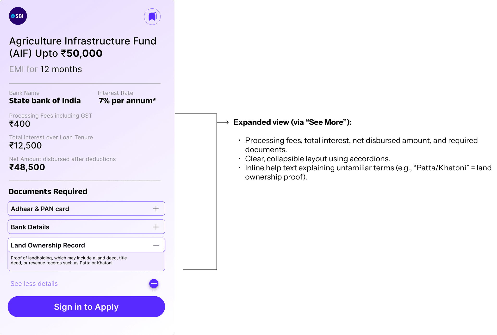
This structure leverages progressive disclosure and visual hierarchy to simplify comprehension. Users can decide when they want to dive deeper, staying in control of their information journey.
This structure leverages progressive disclosure and visual hierarchy to simplify comprehension. Users can decide when they want to dive deeper, staying in control of their information journey.
05
05
Encouraging Users to Complete the Journey
When users find a loan that fits, that’s their moment of intent. Instead of making them go back to a generic sign-up screen, I placed a ‘Sign in to Apply’ button right inside the expanded loan card.
By this point, users have already explored and invested effort. They know what they want — and signing in feels like a natural next step, not a barrier.
This ties directly to Fogg’s Behavior Model: motivation peaks when clarity and confidence are high.
When users find a loan that fits, that’s their moment of intent. Instead of making them go back to a generic sign-up screen, I placed a ‘Sign in to Apply’ button right inside the expanded loan card.
By this point, users have already explored and invested effort. They know what they want — and signing in feels like a natural next step, not a barrier.
This ties directly to Fogg’s Behavior Model: motivation peaks when clarity and confidence are high.

Outcomes
What the redesign delivered
The redesigned discovery flow:
Builds trust early by allowing exploration before registration.
Keeps search intuitive and filters contextual.
Presents information gradually, reducing overwhelm.
Encourages confident sign-ups at the right moment.
In short, it turns loan discovery from a system task into a human experience.
The redesigned discovery flow:
Builds trust early by allowing exploration before registration.
Keeps search intuitive and filters contextual.
Presents information gradually, reducing overwhelm.
Encourages confident sign-ups at the right moment.
In short, it turns loan discovery from a system task into a human experience.

Reducing Support Dependency Through Design and Financial Clarity
IDFC FIRST Bank × BCG

Title
January 1, 1970

Title
January 1, 1970

Title
January 1, 1970
Title
January 1, 1970
Reducing Support Dependency Through Design and Financial Clarity
IDFC FIRST Bank × BCG
Paper Bullet: Persuasion, Propaganda & India's Role in WWII
Communication Design
TCS . World Economic Forum
ChAI Central - AI Flavorist

Improving Loan Discoverability for Rural Borrowers in India
January 1, 1970
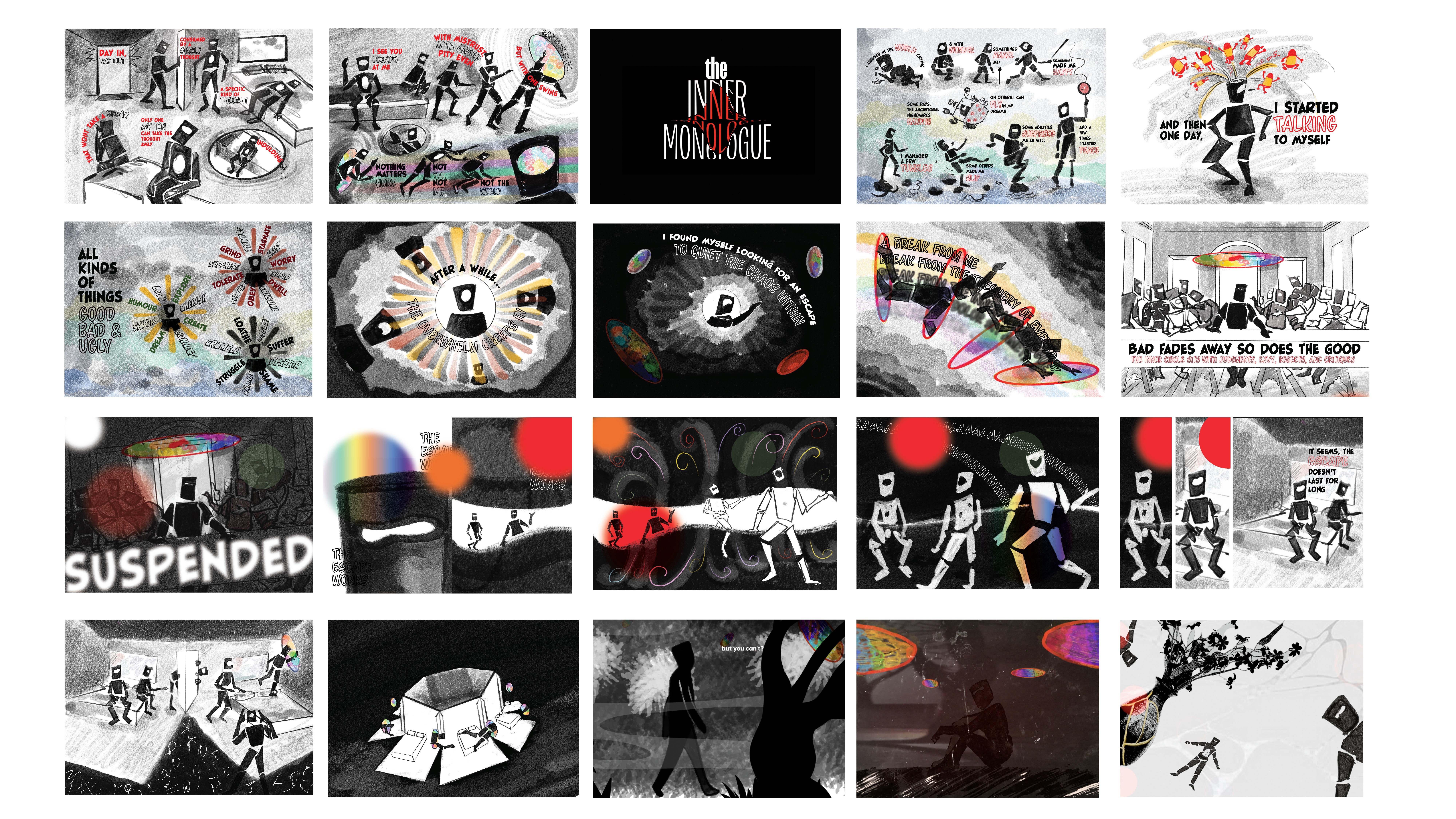
Projects across visual and motion design
Branding and Strategy
LET'S WORK
TOGETHER
BASED in New Delhi INDIA

UX + Communication Designer
LET'S WORK
TOGETHER
BASED in INDIA . UX Designer
LET'S WORK
TOGETHER
BASED in New Delhi INDIA
UX + Communication Designer