IIT Delhi Thesis x United Service Institution of India (USI). 2025
Communication Design & Publication design
Paper Bullet: A visual catalogue
Persuasion, Propaganda & India's Role in WWII
A visual catalogue of WWII propaganda targeting India — archiving the leaflets, posters, and psychological weapons that were designed to conquer minds when bullets couldn’t reach them.
A visual catalogue of WWII propaganda targeting India — archiving the leaflets, posters, and psychological weapons that were designed to conquer minds when bullets couldn’t reach them.
Research
A mountain of data
All of this material had been collected during the war itself and had been sitting in the archival libraries of the USI ever since. I was given the chance to visit and go through it in person, to see what was actually there and figure out what the catalogue needed. Walking through those shelves, I came across thousands of posters, leaflets, matchboxes, booklets, and all kinds of printed collectibles from across the war years. I ended up scanning a large portion of it on the spot, so I could start building a digital catalogue first and work from that.
All of this material had been collected during the war itself and had been sitting in the archival libraries of the USI ever since. I was given the chance to visit and go through it in person, to see what was actually there and figure out what the catalogue needed. Walking through those shelves, I came across thousands of posters, leaflets, matchboxes, booklets, and all kinds of printed collectibles from across the war years. I ended up scanning a large portion of it on the spot, so I could start building a digital catalogue first and work from that.

Thousands of pieces of archival propaganda material, collected during the war and preserved in the USI library
Understanding the Battlefield
A literal map in my mind
Understanding the material meant understanding the war first. I started by mapping out the full timeline of the Second World War: the major events, the key players, the order in which things happened. As a visual person, I always work well with a map in my mind. A literal map became the crux here. It helped me understand which countries shared boundaries, what the geographic proximity between the different theatres looked like, and where the specific events and places we were dealing with actually sat in relation to each other.
While working through all of this, I started building information design pieces for my own understanding. What began as personal notes turned into something more structured: spreads tracing the story of the war as a visual sequence. This work later became the source material from which the book’s visual library took shape. The propaganda map and the story-of-WWII spreads became core assets of the published book itself, not just research tools.
Understanding the material meant understanding the war first. I started by mapping out the full timeline of the Second World War: the major events, the key players, the order in which things happened. As a visual person, I always work well with a map in my mind. A literal map became the crux here. It helped me understand which countries shared boundaries, what the geographic proximity between the different theatres looked like, and where the specific events and places we were dealing with actually sat in relation to each other.
While working through all of this, I started building information design pieces for my own understanding. What began as personal notes turned into something more structured: spreads tracing the story of the war as a visual sequence. This work later became the source material from which the book’s visual library took shape. The propaganda map and the story-of-WWII spreads became core assets of the published book itself, not just research tools.
Through this phase I was also watching a lot of documentaries and reading extensively on the period, which kept setting the visual tone and the level of historical detail the book needed to carry.
Through this phase I was also watching a lot of documentaries and reading extensively on the period, which kept setting the visual tone and the level of historical detail the book needed to carry.

Propaganda Map: World War II — designed to understand and then communicate the geographic and ideological landscape that every piece of propaganda material existed within


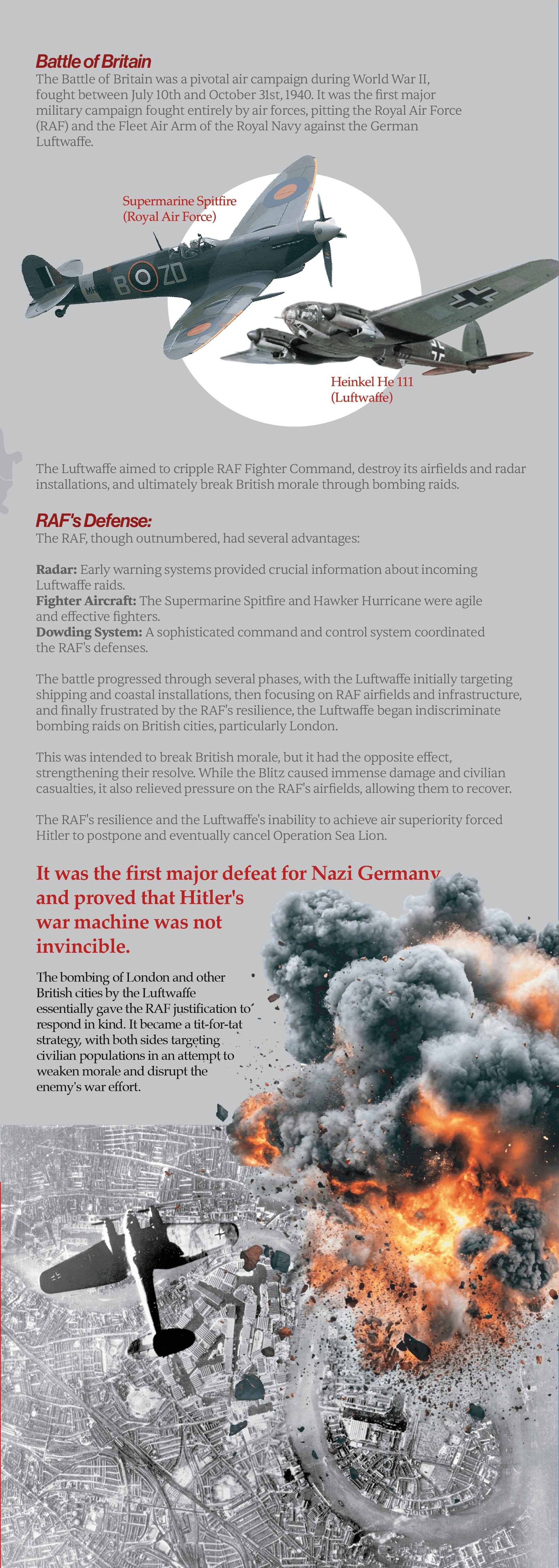


Information design spreads built for personal understanding of the war’s timeline — later became part of the book’s context-building chapters
Making Sense of the Material
Categorise, contextualise, name
With the scanning done and the timeline mapped, the next challenge was making sense of the volume. There was a three-step process: first, analysing everything together to see the full scope of what existed; second, curating each piece by its visual origin and specific message; third, setting up chronological context and separating additional material into artefact-type categories.
This step was critical because the material came from many different sources, each with a different target and a different intent. Japanese propaganda aimed at Indian soldiers. British propaganda aimed at Indian troops, at the Indian diaspora, at civilian populations in specific regions. INA materials calling for defection. Each category was not just about who made it, but about what exactly it was trying to propagate and who it was trying to reach. That clarity about purpose shaped everything about how the book was eventually structured.
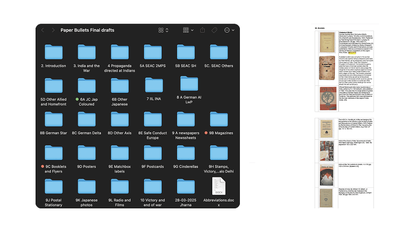
The second part of this was granular: foldering and naming every single piece, tagging it with its timeline, its source, the language it was printed in, and its intended audience. That taxonomy is what the whole book was built on.
With the scanning done and the timeline mapped, the next challenge was making sense of the volume. There was a three-step process: first, analysing everything together to see the full scope of what existed; second, curating each piece by its visual origin and specific message; third, setting up chronological context and separating additional material into artefact-type categories.
This step was critical because the material came from many different sources, each with a different target and a different intent. Japanese propaganda aimed at Indian soldiers. British propaganda aimed at Indian troops, at the Indian diaspora, at civilian populations in specific regions. INA materials calling for defection. Each category was not just about who made it, but about what exactly it was trying to propagate and who it was trying to reach. That clarity about purpose shaped everything about how the book was eventually structured.
The second part of this was granular: foldering and naming every single piece, tagging it with its timeline, its source, the language it was printed in, and its intended audience. That taxonomy is what the whole book was built on.
Analyse at all the data we had
Analyse at all the data we had
Curating visuals specific to
its origin and messaging
Curating visuals specific to its origin and messaging
Curating visuals specific to its origin and messaging
Setting up context and chronology
and segregating additional material
into artifact-type categories
Setting up context and chronology and segregating additional material into artifact-type categories
Setting up context and chronology and segregating additional material into artifact-type categories
Information design spreads built for personal understanding of the war’s timeline — later became part of the book’s context-building chapters
Visual Strategy
Let the material speak
The design language had to feel of the era without recreating it. I wanted the book to be bold. The propaganda material was already extremely high on visual intensity, so everything around it had to be simple, structured, and quiet enough to let the artefacts peak. That became the one rule that all other decisions came back to.
A colour palette inspired by wartime print: reds, sepias, military greens, worn paper tones. The layout modular, alternating full-bleed images with annotated pages and deliberate white space. Every original artefact scanned and presented with the surface quality preserved rather than cleaned up.
Typography was chosen for legibility and period reference, with clear hierarchies across dense pages.
The design language had to feel of the era without recreating it. I wanted the book to be bold. The propaganda material was already extremely high on visual intensity, so everything around it had to be simple, structured, and quiet enough to let the artefacts peak. That became the one rule that all other decisions came back to.
A colour palette inspired by wartime print: reds, sepias, military greens, worn paper tones. The layout modular, alternating full-bleed images with annotated pages and deliberate white space. Every original artefact scanned and presented with the surface quality preserved rather than cleaned up.
Typography was chosen for legibility and period reference, with clear hierarchies across dense pages.


Grid System & Typography
Getting into the design space
While all of this research and curation was happening, I was getting into the design space in parallel. I started building grid systems and testing them through small booklets, to understand which structure could hold the most variation. The book needed to handle pages that were entirely image, pages dense with analysis, and everything in between. Three systems were tested, each with a dedicated booklet showing how both image-heavy and text-heavy pages actually behaved in that structure.
While all of this research and curation was happening, I was getting into the design space in parallel. I started building grid systems and testing them through small booklets, to understand which structure could hold the most variation. The book needed to handle pages that were entirely image, pages dense with analysis, and everything in between. Three systems were tested, each with a dedicated booklet showing how both image-heavy and text-heavy pages actually behaved in that structure.

This exploration considered the square format of the book, ensuring a balanced yet modular layout. However, a key limitation was that the three equal sections naturally led to a strict left, center, and right division, which, while visually harmonious, lacked flexibility for more dynamic compositions.
This exploration considered the square format of the book, ensuring a balanced yet modular layout. However, a key limitation was that the three equal sections naturally led to a strict left, center, and right division, which, while visually harmonious, lacked flexibility for more dynamic compositions.


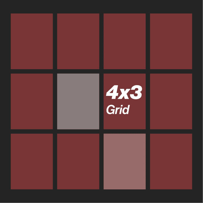
The second grid system, 4 columns by 3 rows, proved to be versatile and structurally sound.
The four-column division allowed for finer content adjustments, and the three-row structure facilitated alignment with the golden section, ensuring an aesthetically pleasing composition. This system offered better control over typographic spacing imagery integration, and white space management, making it the optimal choice for the final
publication.
The second grid system, 4 columns by 3 rows, proved to be versatile and structurally sound.
The four-column division allowed for finer content adjustments, and the three-row structure facilitated alignment with the golden section, ensuring an aesthetically pleasing composition. This system offered better control over typographic spacing imagery integration, and white space management, making it the optimal choice for the final
publication.


4-column by 6-row modular grid, allowing for high flexibility in text and image placement. This grid enabled detailed segmentation of content, particularly useful for layering historical artifacts, captions, and annotations while maintaining a strong vertical rhythm.
4-column by 6-row modular grid, allowing for high flexibility in text and image placement. This grid enabled detailed segmentation of content, particularly useful for layering historical artifacts, captions, and annotations while maintaining a strong vertical rhythm.


The 4 x 6 grid had the most range and became the final system. Within that, I was also experimenting with different type combinations under each grid to understand how the typeface choice affected the page’s character.
The 4 x 6 grid had the most range and became the final system. Within that, I was also experimenting with different type combinations under each grid to understand how the typeface choice affected the page’s character.
Neue Haas Grotesk carries authority at large display sizes, which matched the directness of the propaganda material it was sitting alongside. Sentient brought a slightly warmer, more literary quality to the body text, which kept long analysis passages readable without feeling clinical. Together they created enough contrast between headline and copy that the hierarchy was always clear, even on pages where the type was competing with very strong imagery.
Neue Haas Grotesk carries authority at large display sizes, which matched the directness of the propaganda material it was sitting alongside. Sentient brought a slightly warmer, more literary quality to the body text, which kept long analysis passages readable without feeling clinical. Together they created enough contrast between headline and copy that the hierarchy was always clear, even on pages where the type was competing with very strong imagery.
Narrative Structure
How the book is organised
The structure of Paper Bullets follows a loosely chronological but thematically curated logic. The early chapters build historical context, placing the reader inside the geopolitical situation before the artefacts begin. As the book progresses, the structure shifts from chronological to thematic: later chapters are organised by the material nature of the artefacts themselves, postcards, stamps, booklets, posters, postal stationery. That move allows the reader to compare across formats and ideologies rather than following a single propaganda thread from start to finish.
There are twelve chapters in total, from An Introduction to The Last Illusion. The chapter structure was shaped significantly by Sqn Ldr Chhina, who kept pushing the sequencing toward a structure that could hold the full complexity of what these objects meant, as designed things with specific visual strategies and intended effects, not just historical documents.
The structure of Paper Bullets follows a loosely chronological but thematically curated logic. The early chapters build historical context, placing the reader inside the geopolitical situation before the artefacts begin. As the book progresses, the structure shifts from chronological to thematic: later chapters are organised by the material nature of the artefacts themselves, postcards, stamps, booklets, posters, postal stationery. That move allows the reader to compare across formats and ideologies rather than following a single propaganda thread from start to finish.
There are twelve chapters in total, from An Introduction to The Last Illusion. The chapter structure was shaped significantly by Sqn Ldr Chhina, who kept pushing the sequencing toward a structure that could hold the full complexity of what these objects meant, as designed things with specific visual strategies and intended effects, not just historical documents.

Image Treatment & Layout
Rough edges and all
Every artefact in the book was scanned directly from the original. I kept the rough edges, the torn paper, the aged surface quality. There was no clean cropping and no colour correction to make things look pristine. These materials were printed on cheap, thin paper designed for mass distribution and immediate disposal. That fragility is part of what they communicate. Removing the rough edges would have been dishonest.
Every artefact in the book was scanned directly from the original. I kept the rough edges, the torn paper, the aged surface quality. There was no clean cropping and no colour correction to make things look pristine. These materials were printed on cheap, thin paper designed for mass distribution and immediate disposal. That fragility is part of what they communicate. Removing the rough edges would have been dishonest.

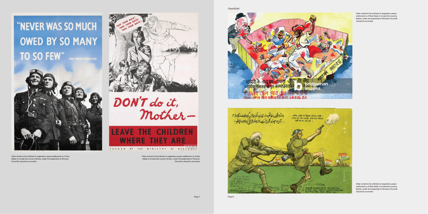
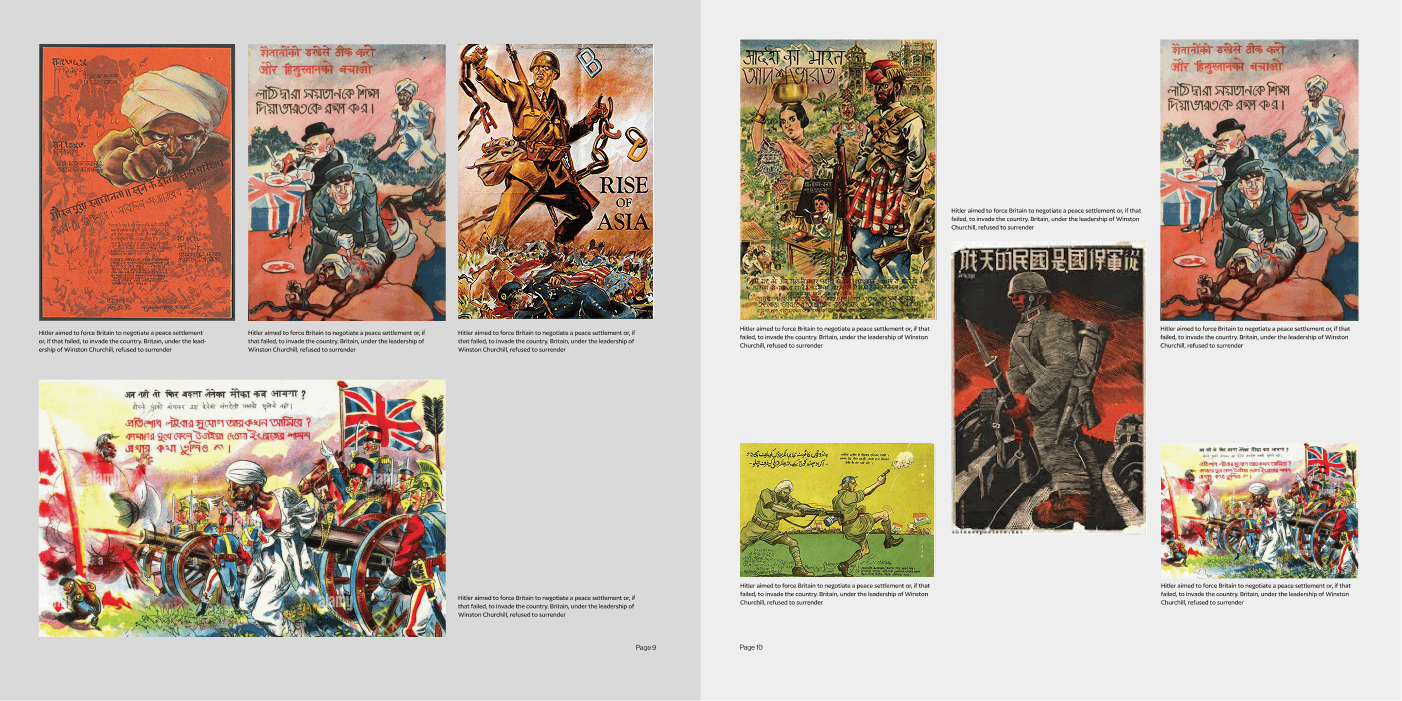
Image treatment: the scan is used as-is, with rough edges and original paper quality intact. Left shows the full scan in context; right gives the image more room while keeping everything that makes it a real artefact
Once the image treatment was settled, the layout system had to hold three sizes of text alongside these artefacts: a display header that could anchor a chapter opener, a body size that carried long-form analysis without feeling dense, and a caption size that stayed close to the image and read easily at a glance. The three sizes had to coexist on the same page without competing, each doing a distinct job
Once the image treatment was settled, the layout system had to hold three sizes of text alongside these artefacts: a display header that could anchor a chapter opener, a body size that carried long-form analysis without feeling dense, and a caption size that stayed close to the image and read easily at a glance. The three sizes had to coexist on the same page without competing, each doing a distinct job

Layout explorations: the grid system across different content types, showing how header, body, and caption sizes distribute across image-heavy and analysis pages

Multiple spreads in context: the layout system working across the Japanese propaganda chapter, image-led and text-led pages sitting within the same structure



The Book
What it became
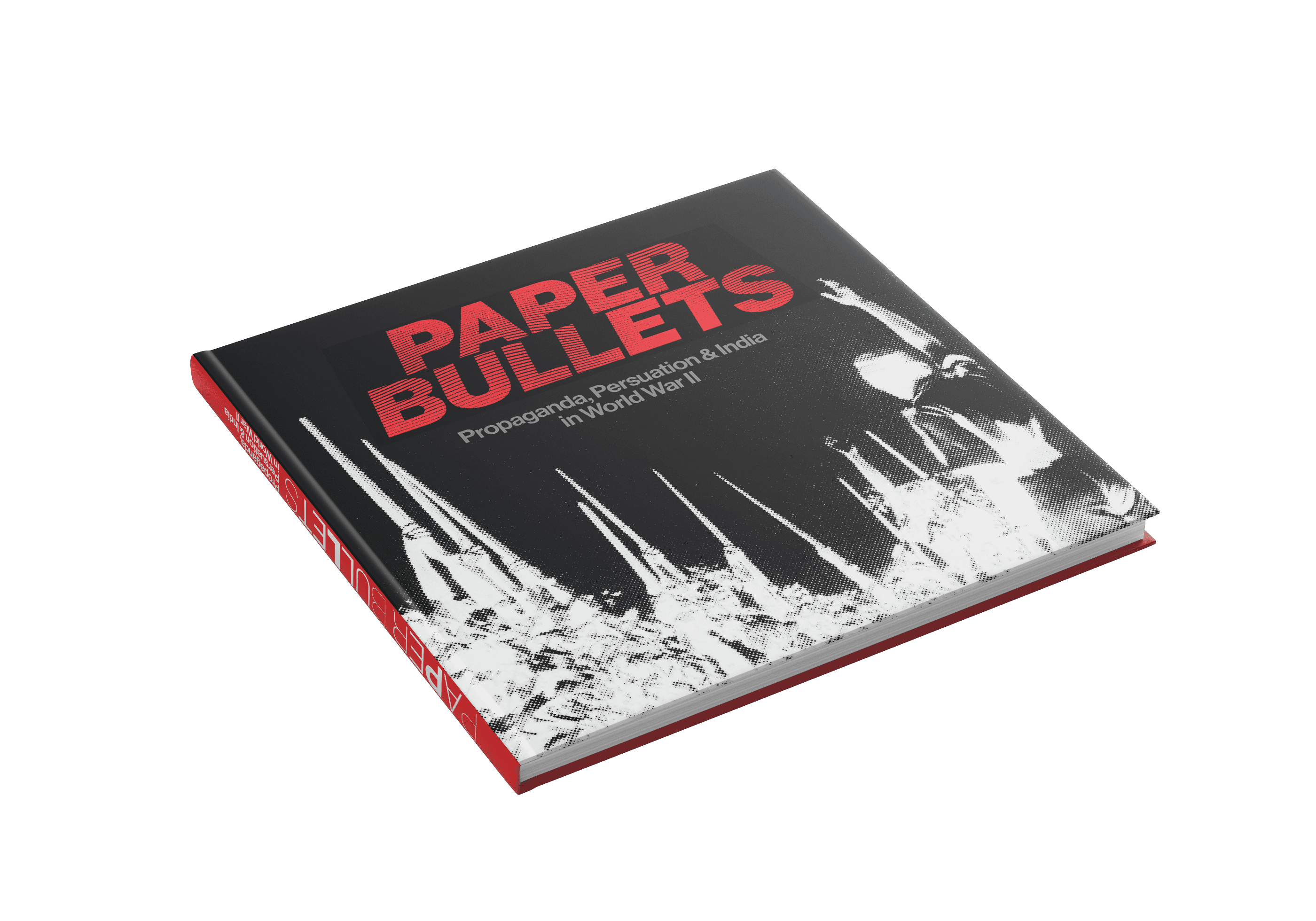
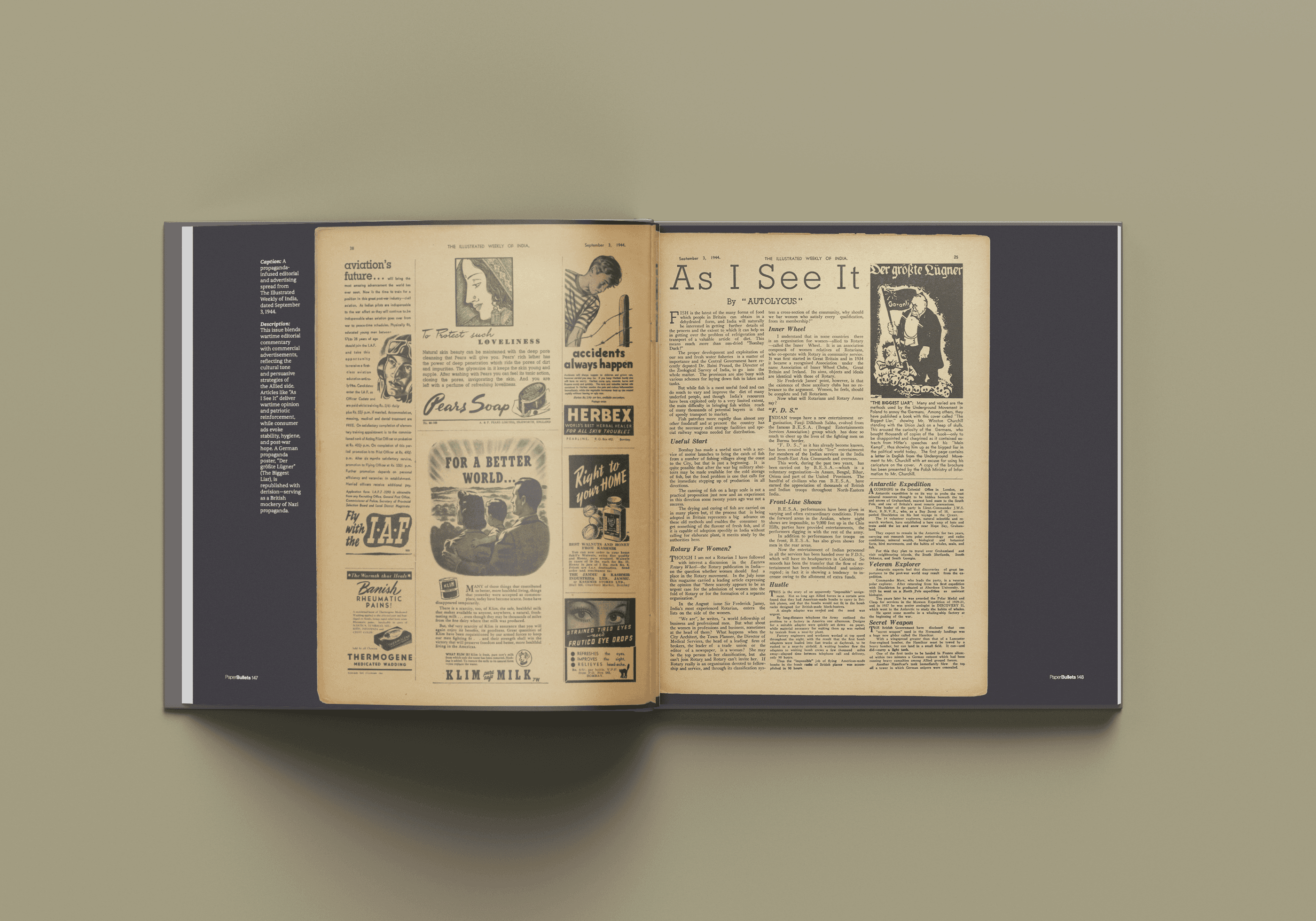
Paper Bullets is printed on 130gsm matte paper with thread binding for a flat-lay format. The binding was a practical decision that became a conceptual one: a book with this much imagery needs to open fully and lie flat so the reader sees the spreads exactly as they were designed. Thread binding also made the book feel considered and durable, which felt right for a catalogue of fragile things.
Paper Bullets is printed on 130gsm matte paper with thread binding for a flat-lay format. The binding was a practical decision that became a conceptual one: a book with this much imagery needs to open fully and lie flat so the reader sees the spreads exactly as they were designed. Thread binding also made the book feel considered and durable, which felt right for a catalogue of fragile things.


Reducing Support Dependency Through Design and Financial Clarity
IDFC FIRST Bank × BCG

Paper Bullet: Persuasion, Propaganda & India's Role in WWII
Communication Design

TCS . World Economic Forum
ChAI Central - AI Flavorist

Improving Loan Discoverability for Rural Borrowers in India
User Experience Design
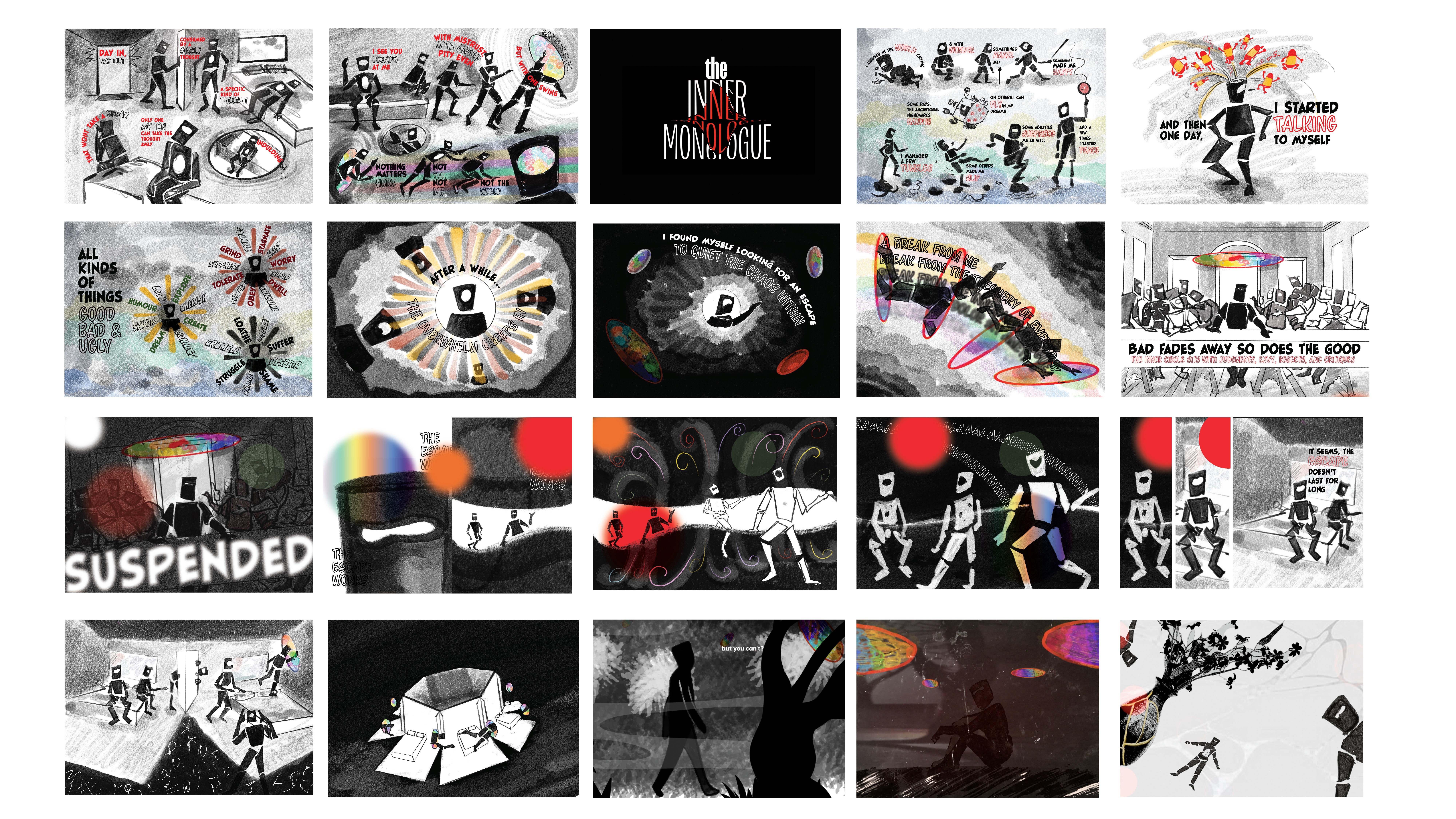
Projects across visual and motion design
Branding and Strategy
Reducing Support Dependency Through Design and Financial Clarity
IDFC FIRST Bank × BCG
Paper Bullet: Persuasion, Propaganda & India's Role in WWII
Communication Design
TCS . World Economic Forum
ChAI Central - AI Flavorist
Improving Loan Discoverability for Rural Borrowers in India
User Experience Design
Projects across visual and motion design
Branding and Strategy
LET'S WORK
TOGETHER
BASED in New Delhi INDIA

UX + Communication Designer
LET'S WORK
TOGETHER
BASED in New Delhi INDIA
UX + Communication Designer
LET'S WORK
TOGETHER
BASED in INDIA . UX Designer